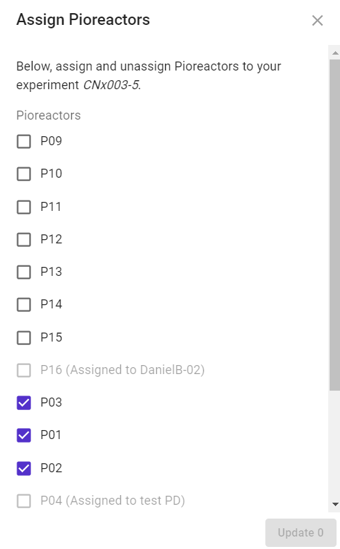
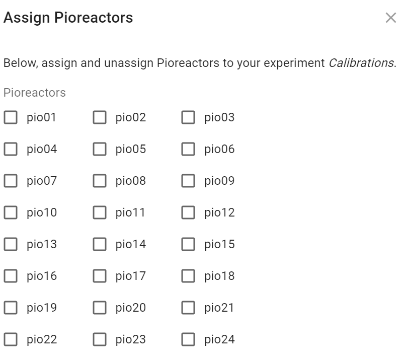
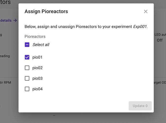
Would it be worth to improve the Assign Pioreactors pop-up window so that the pioreactors will be illustrated also on the side in a 3 x 3 structure? This will be more space efficient and also will eliminate the need for scrolling down in bigger clusters such as in my case where I have 16.
In addition, do you consider to add a reorganize command to check and re-align the pioreactor arrangement to enable users correct their cluster if in case they get mis-aligned such as in my cluster as illustrated below? This occured, after I removed the first 8 pioreactors and re-added them to the cluster. I do not know exactly how and why this slipped through the correction process but it happened.


