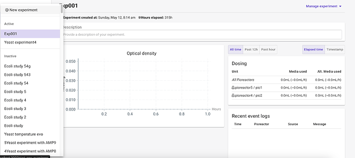
I noticed that it is a little troublesome to distinguish at a quick glance which experiments are currently running. Would it be possible to add a distinguishing color to whichever experiments have pioreactors currently assigned or current running experiments? Maybe a separate tab for current experiments?
Great idea! We’ll share some ideas here and put it in the next release
Do you consider to add an “improvement” category to tag ideas similar to this in the form?
I also have some suggestions but did not wanted to create a topic specifically for each of them. Hence, I would appreciate to if you prefer us to share ideas like this here or provide you through email?
Both are fine! I’ll look into creating an “enhancement” or “feedback” tag that can be used for suggestions.
I’ve created a new category for feedback and suggestions: Feedback and suggestions - Pioreactor forum
1 Like
FYI this is now available in v24.5.31
1 Like
