Here’s a quick way to add charts for stirring and PWM duty cycles onto the UI:
On your command line, cd into /home/pioreactor/.pioreactor/plugins/ui/contrib/charts and create a stirring.yaml file by typing nano stirring.yaml.
Copy and paste the following:
chart_key: stirring_rate
data_source: stirring_rates # SQL table
data_source_column: measured_rpm
title: Stirring rate
mqtt_topic: stirring/measured_rpm
source: app
payload_key: measured_rpm
y_axis_label: RPM
interpolation: stepAfter
y_axis_domain: [0, 800]
lookback: 100000
fixed_decimals: 0
You can do the same thing with PWM duty cycles by creating a pwm_dcs.yaml file, and pasting the following:
chart_key: pwm_dcs
data_source: pwm_dcs
data_source_column: channel_1
title: Duty cycles for stirring PWM
mqtt_topic: pwms/dc
source: app
payload_key: "17"
y_axis_label: Duty cycle
interpolation: stepAfter
y_axis_domain: [0, 100]
lookback: 100000
fixed_decimals: 2
Note that you can change the data_source_column based on what channel you set your stirring to in the config.ini.
In your config.ini, add the chart_key for both charts under [ui.overview.charts]:
[ui.overview.charts]
stirring_rate=1
pwm_dcs=1
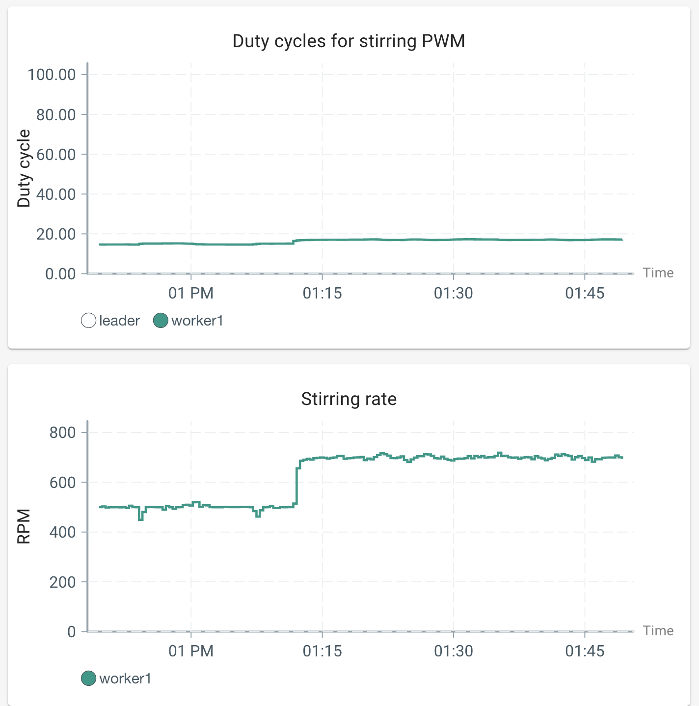
Now, when you refresh your UI homepage, you should see two new charts. These charts offer a quick first order approximation of viscosity, and can have some interesting use-cases for unique liquid cultures. Happy experimenting!
Documentation for adding basic time series charts can be found here: Adding basic time series charts | Pioreactor Docs